Type of Project
Typography, Editorial Design, Brand Design, UX/UI Design, Logo Design
Objective
The objective of this project was to revamp a dying brand in a logical and visually interesting way. I was tasked with creating a brand timeline, mission statement, brand soul, repositioning statement, new logo, and much more. This culminated into a Brand Strategy Book, Brand Guidelines Book, and a functioning website to interact with a lot of the information.
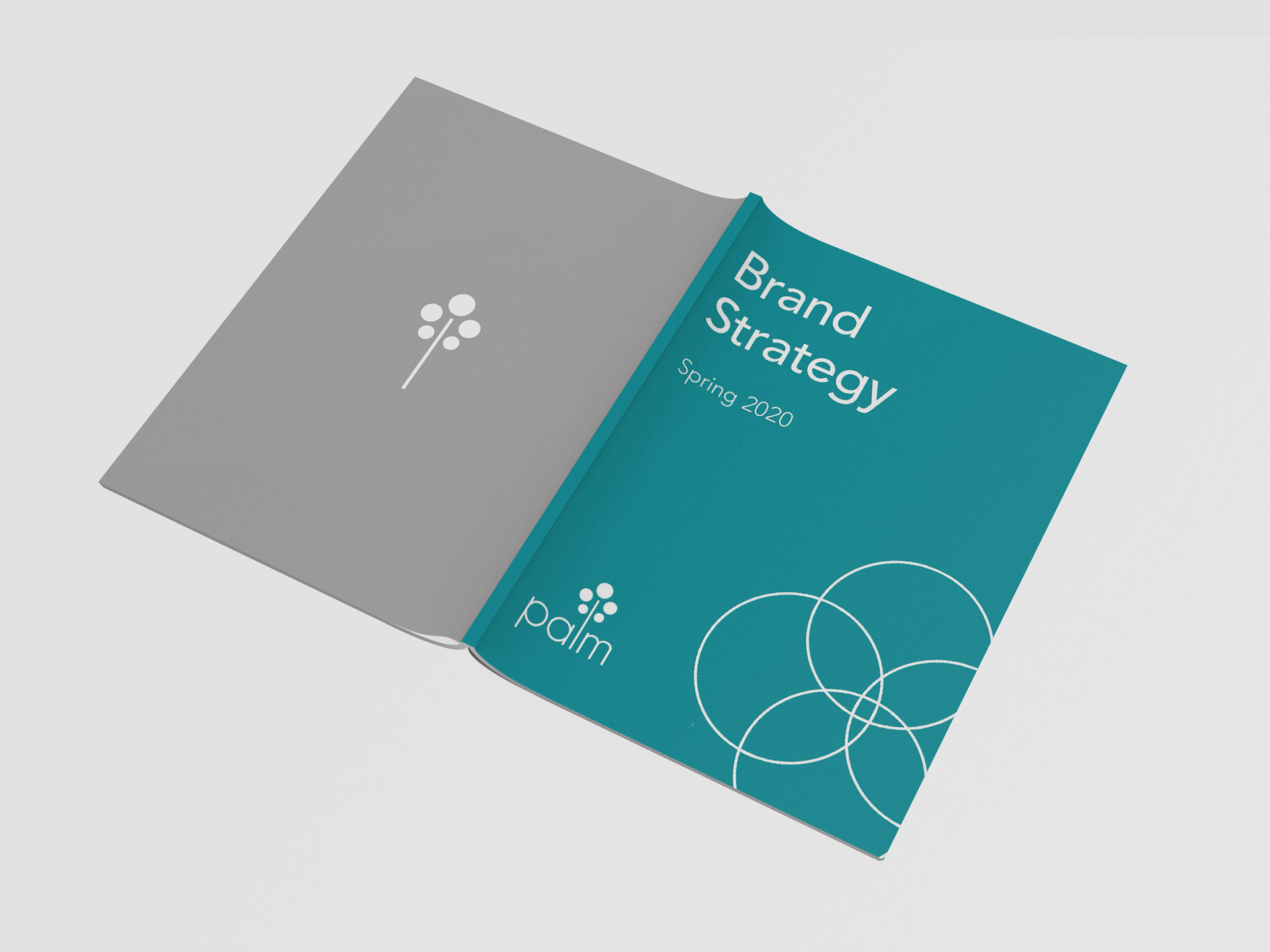
The company I chose was the familiar Palm, Inc. I renamed it Palm, which most people acknowledged it as anyways. The Brand Strategy Book contains the history and company research that lead to the development of the logo, which was the final piece in creating a successful Guidelines Book and corresponding website. The teal, white, and gray color palette gives this brand the light and modern feel I was going for to express Palm's new mission of connecting people with what’s most important in a subtle but meaningful way.
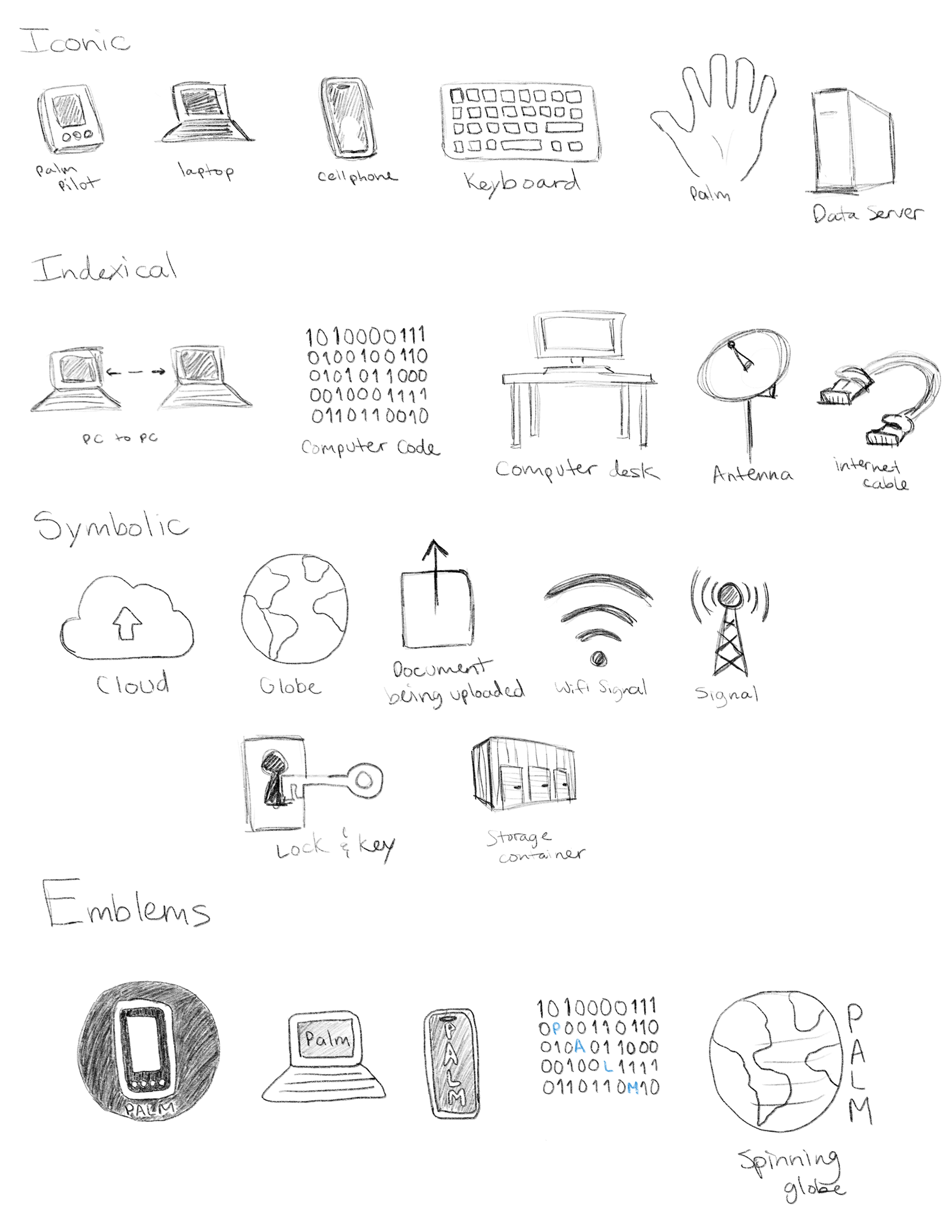
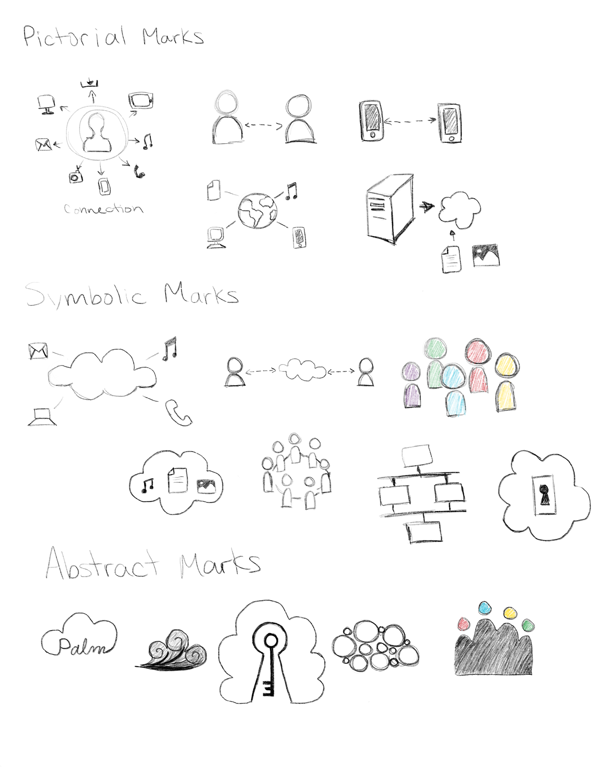
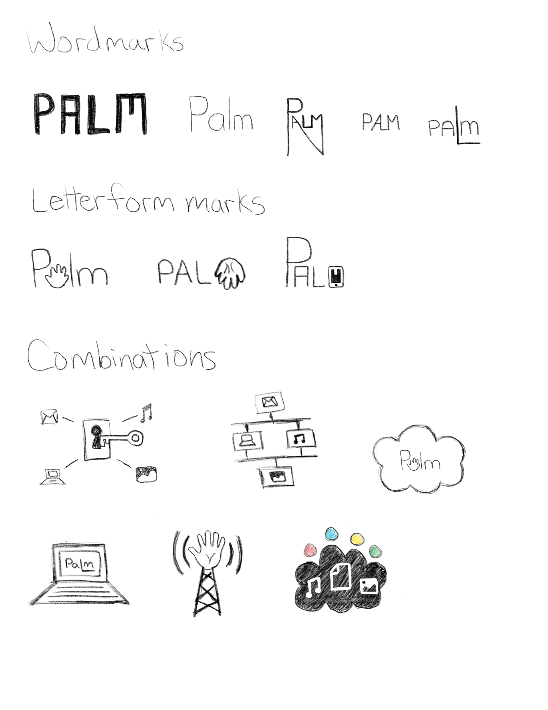
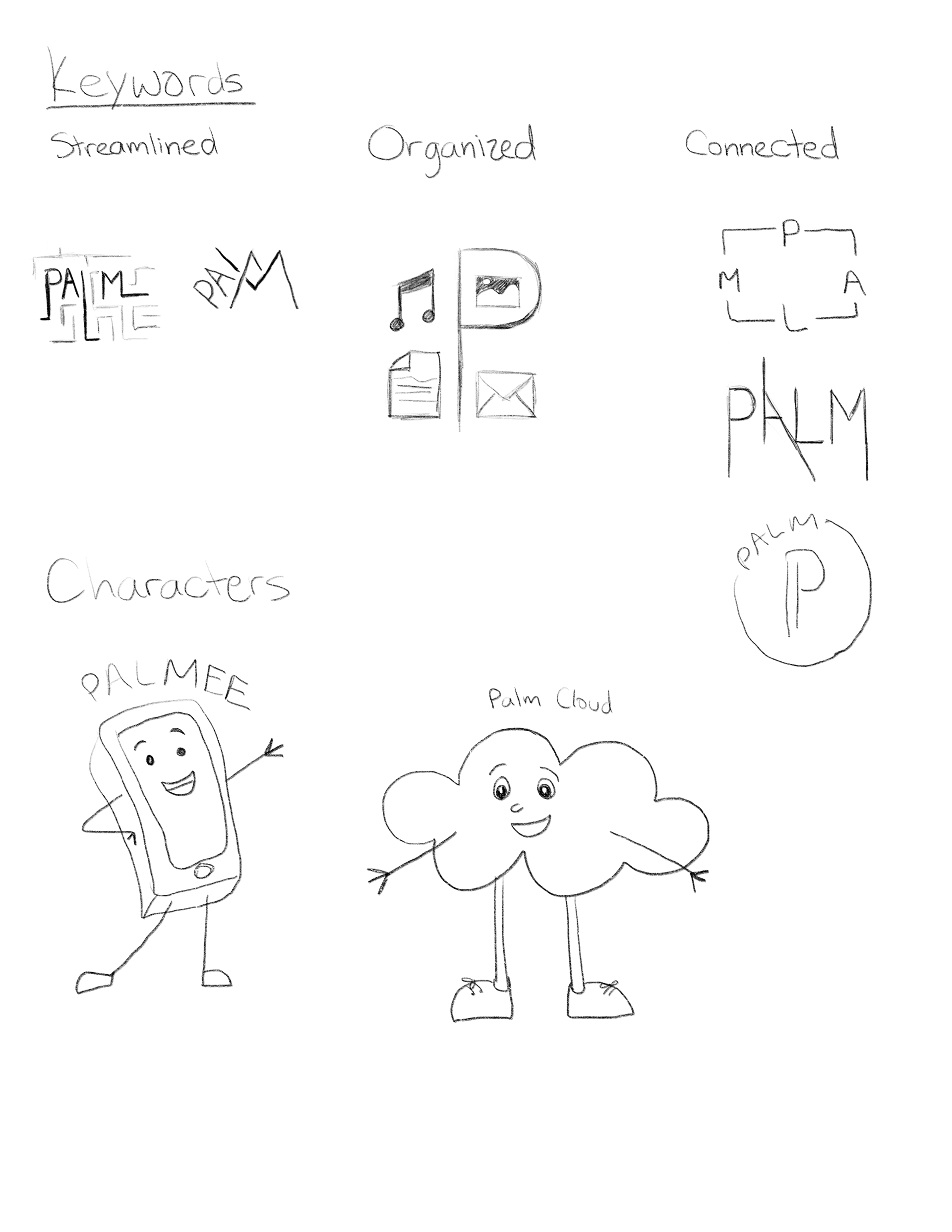
After creating many sketches and keywords to describe the direction I wanted Palm to go, I finally developed a logo that I felt was simple and clean enough to convey the message I wanted. The company motto was to be inclusive, diverse, and have multiple branches, like a tree. It was also legible enough to be understood in a variety of colors and on different colored backgrounds.
The logo represents the idea of connection and data management that Palm strives for with its’ products. The use of a sans serif typeface shows the modern and approachable look Palm is trying to achieve with its’ rebrand. The thinness of the lines make it clean and sleek so it can appeal to a varitey of consumers. Each of the five circles represent every person that uses Palm’s service to connect with each other, as well as their information in the cloud. The “l” in Palm represent the connection we have to each of you and how we will make sure you stay connected with what’s most important.
The logo can be applied as either a wordmark or brand mark, depending on the application. The original teal logo should be applied as much as possible, while still following application guidelines. All other colors in the color palette should only be used if the original logo clashes with the product or image it is being applied to.
The logo can be applied as either a wordmark or brand mark, depending on the application. The original teal logo should be applied as much as possible, while still following application guidelines. All other colors in the color palette should only be used if the original logo clashes with the product or image it is being applied to.
The primary focus of Palm is to bring people and their digital information together as seamlessly and effortlessly as possible. The primary applications would include digital products such as a mobile application with easy data sharing capabilities for families or other close knit groups of people, marketing for Palm to get noticed by new consumers, and a corporate cloud service that will be able to handle large scale data needs along with small companies who just need help easily accessing and organizing small amounts of information.
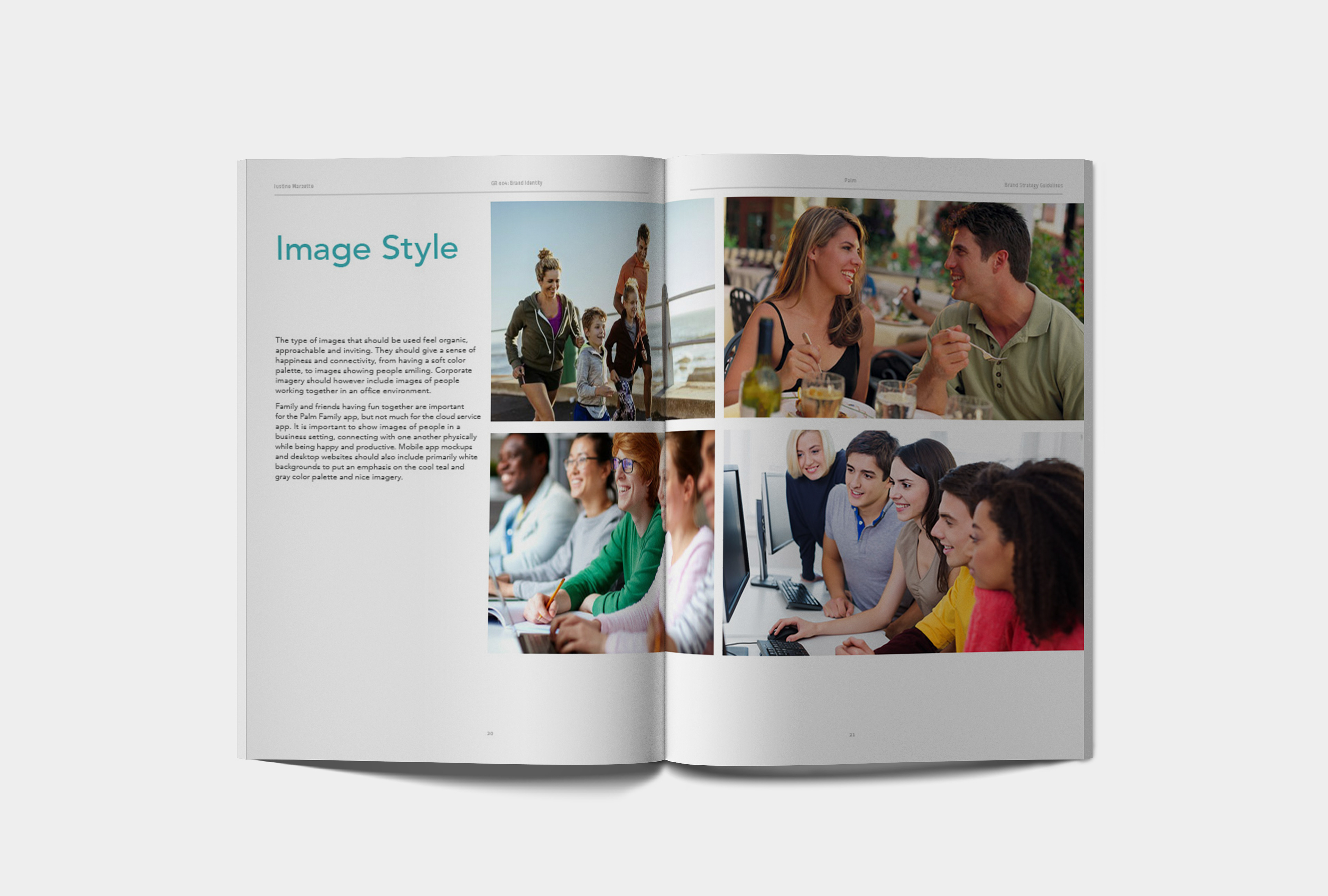
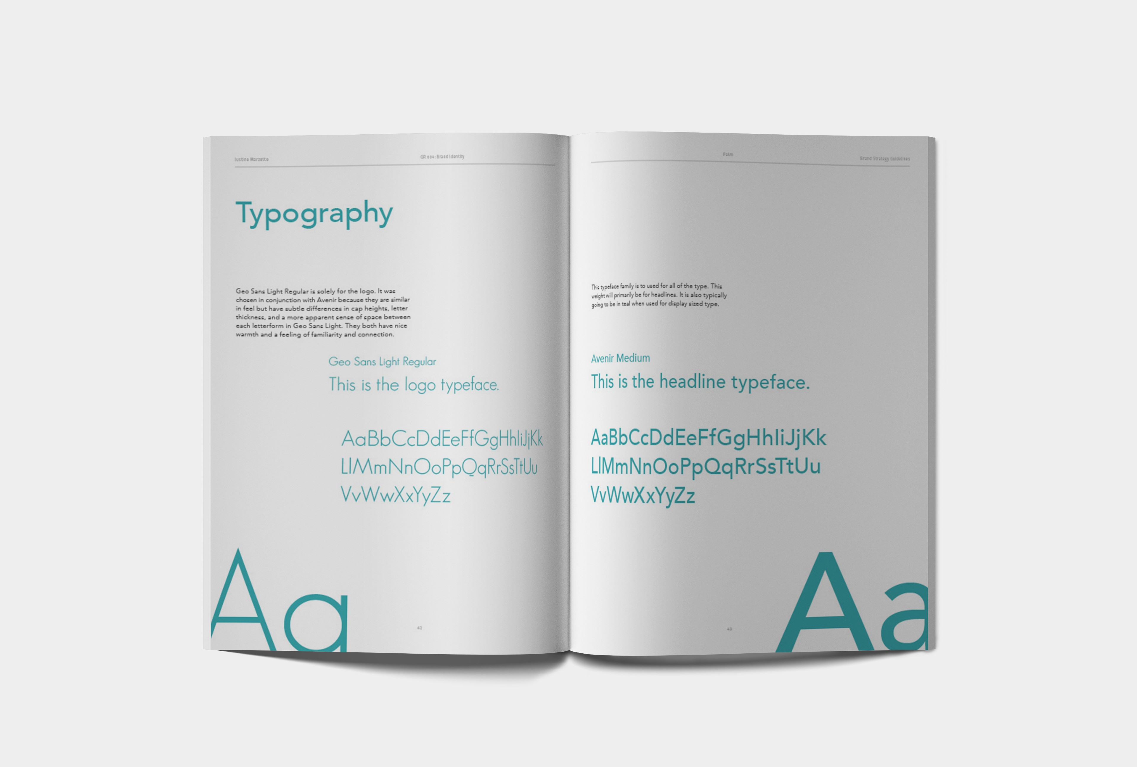

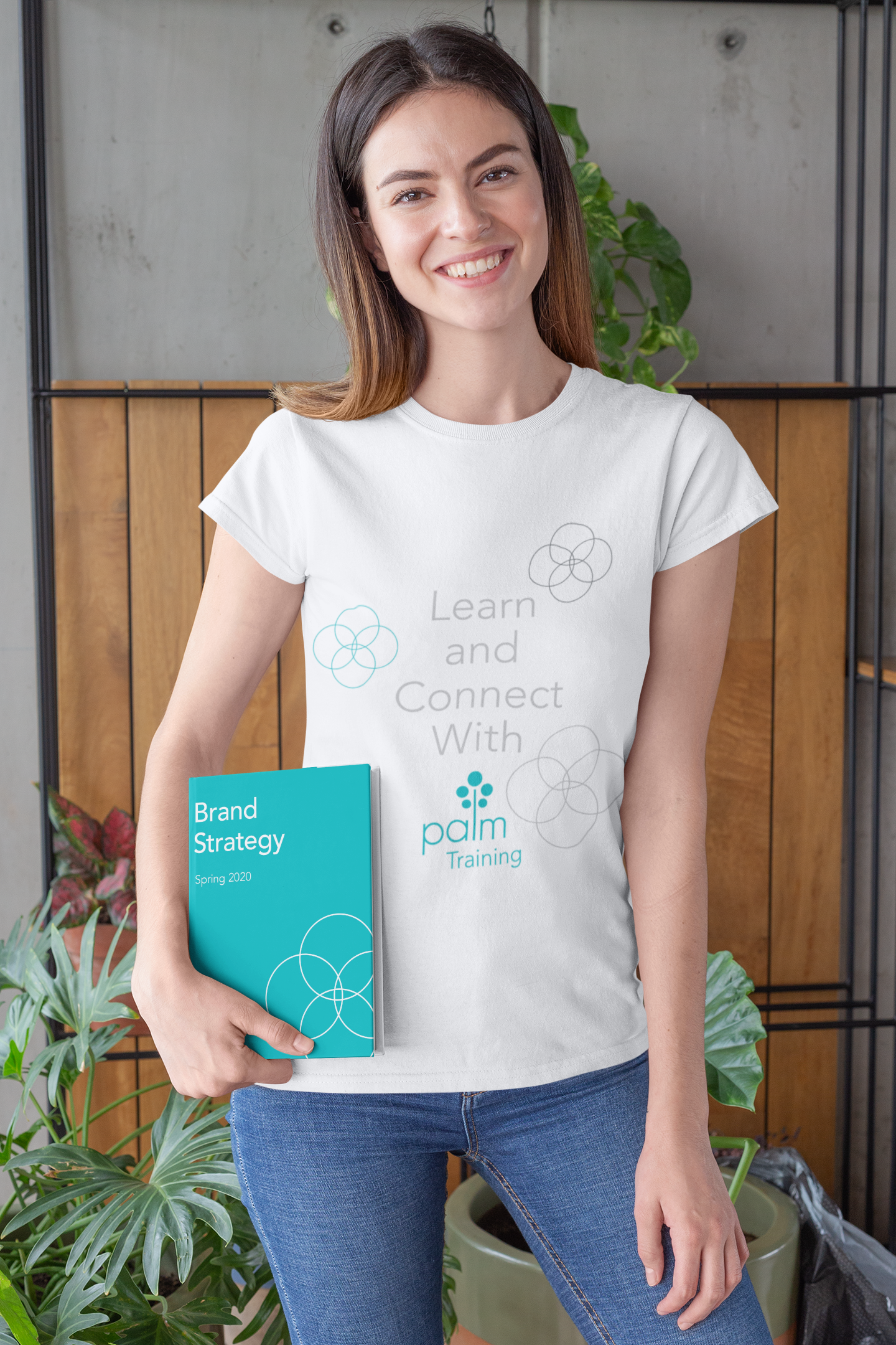
I've included a few pages of the applications in which the logo can be applied. There are also multiple pages of possible signature lockups that include the wordmark and Avenir typeface that displays a clean and legible look.
I tried making the cloud apps versatile and easily interchangeable with future app iterations the company may pursue. A solid colored box separates the imagery while having a connection with the text since they would be the same color.
