Type of Project
Typography, Page Layout Design, Visual Communication, Poster Design, UX/UI Design
Objective
The objective of this project was to create multiple deliverables based on a researched topic for investigation. We were asked to do research on a chosen topic that could influence our target audience in a visually interesting way. It culminated into a project with 3 varied deliverables; a poster series, magazine, website and mobile app.
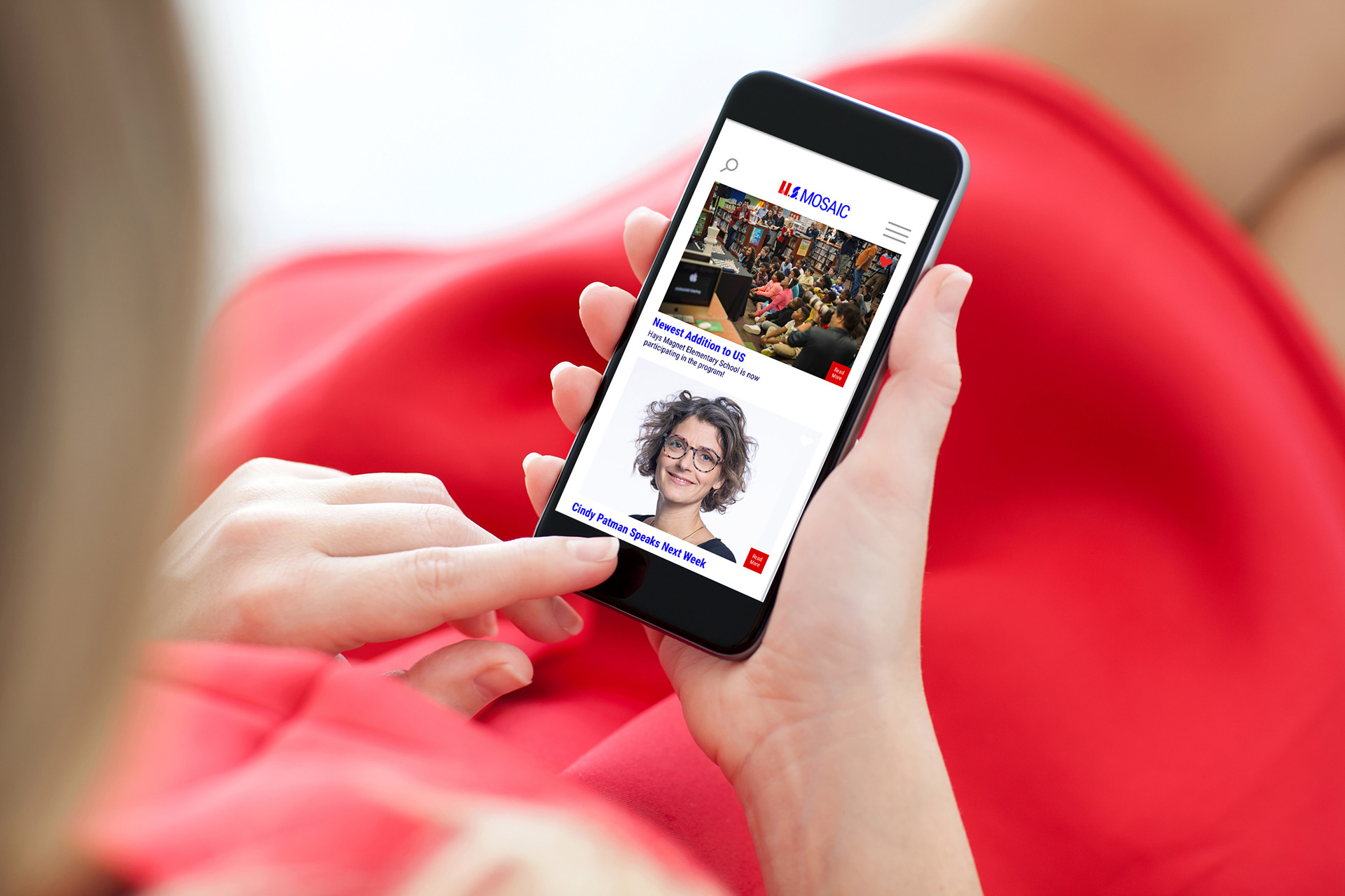
US Mosaic was meant to influence parents and teachers to teach children the importance of cultural diversity in the United States. I hopefully achieved this by combining the use of red, white, blue in different geometric shapes against a condensed sans serif typeface. I used a clean white background for the digital deliverables and used the primary colors for headers and sidebars. There is plenty of detailed information on the website, while only including a subtle amount of text on the posters to give a nice contrast across each deliverable.
After plenty of early exploration, I came up with the title "The US Mosaic" to describe the many different types of people in the world. It's meant to encourage the teaching of different cultures and their ways of life. A mosaic is made up of different sizes, shapes, and colored glass, just like the American people are made up of different backgrounds and ethnicities.
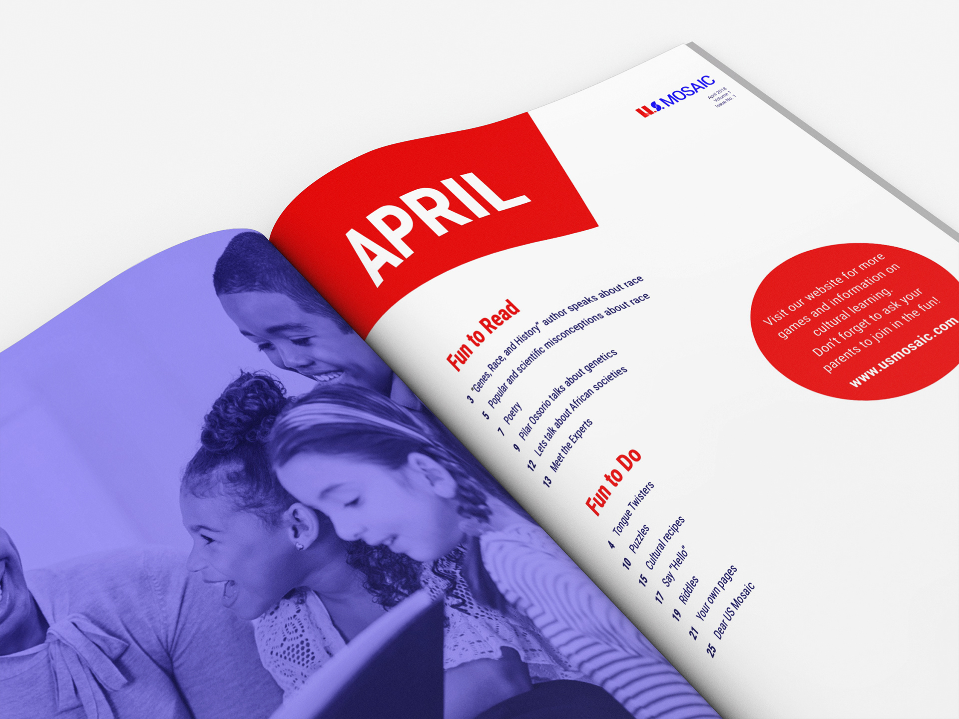
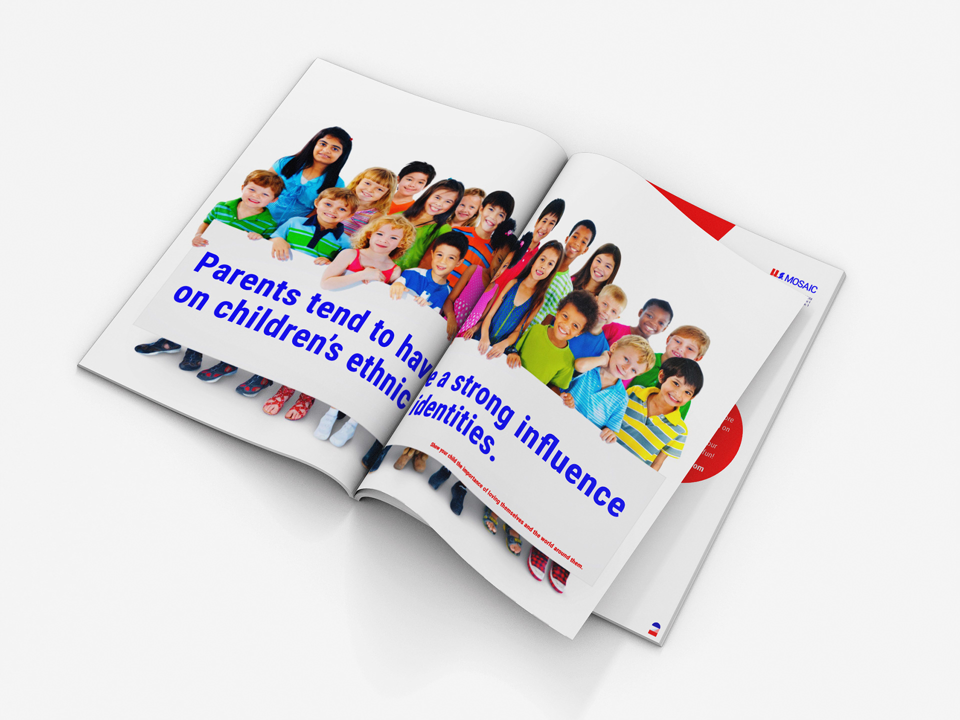
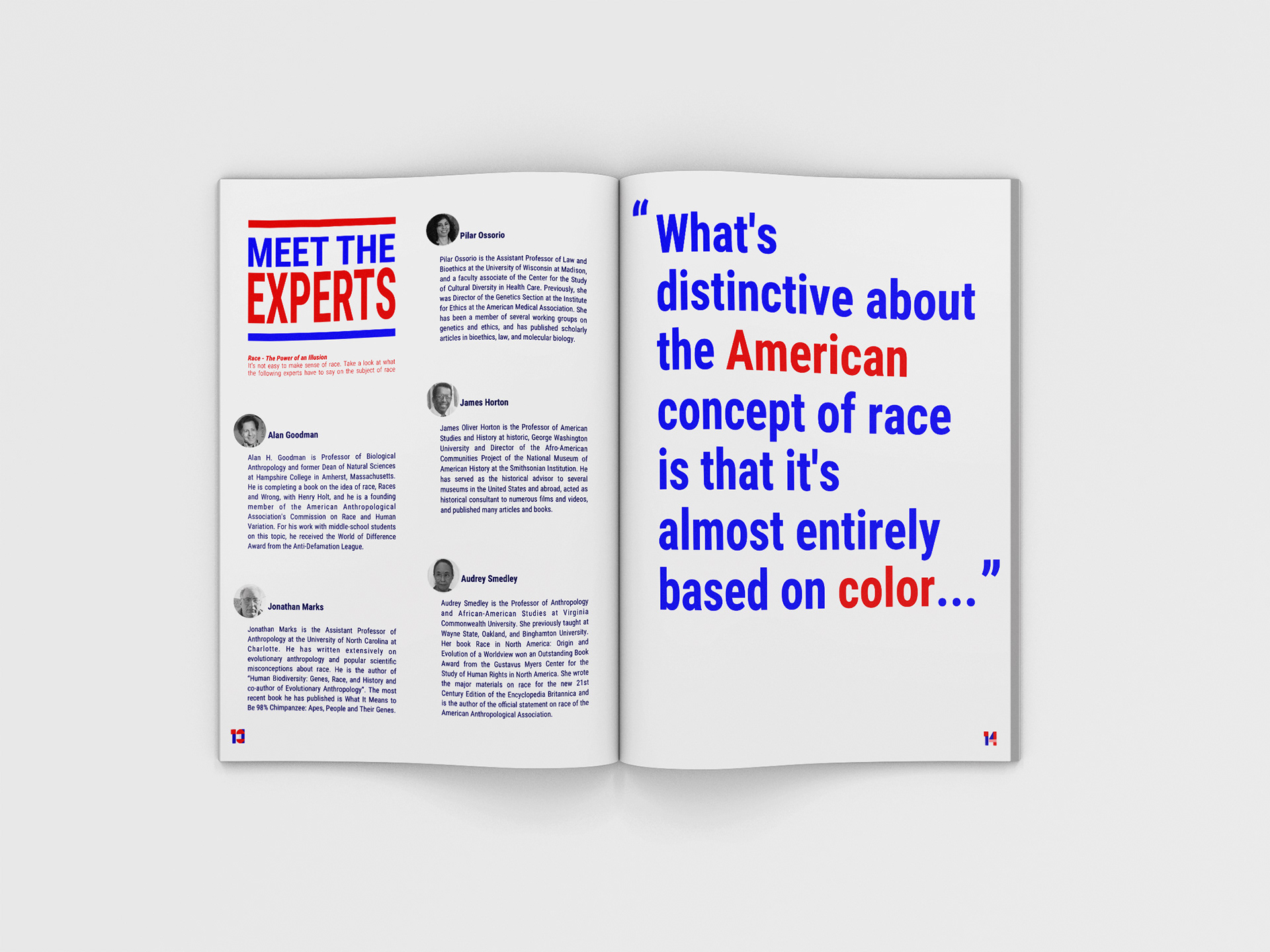
The use of geometric shapes was intended to lead your eye around the poster. It's contrasted with the condensed sans serif typeface and bold colors.


After trying out many variations of typefaces, colors, images, and shapes, I felt that using the American "red, white, and blue" was the best choice to go with a simple sans serif typeface. It's relatable across a variety of audiences and can be easily translated in different languages if needed.
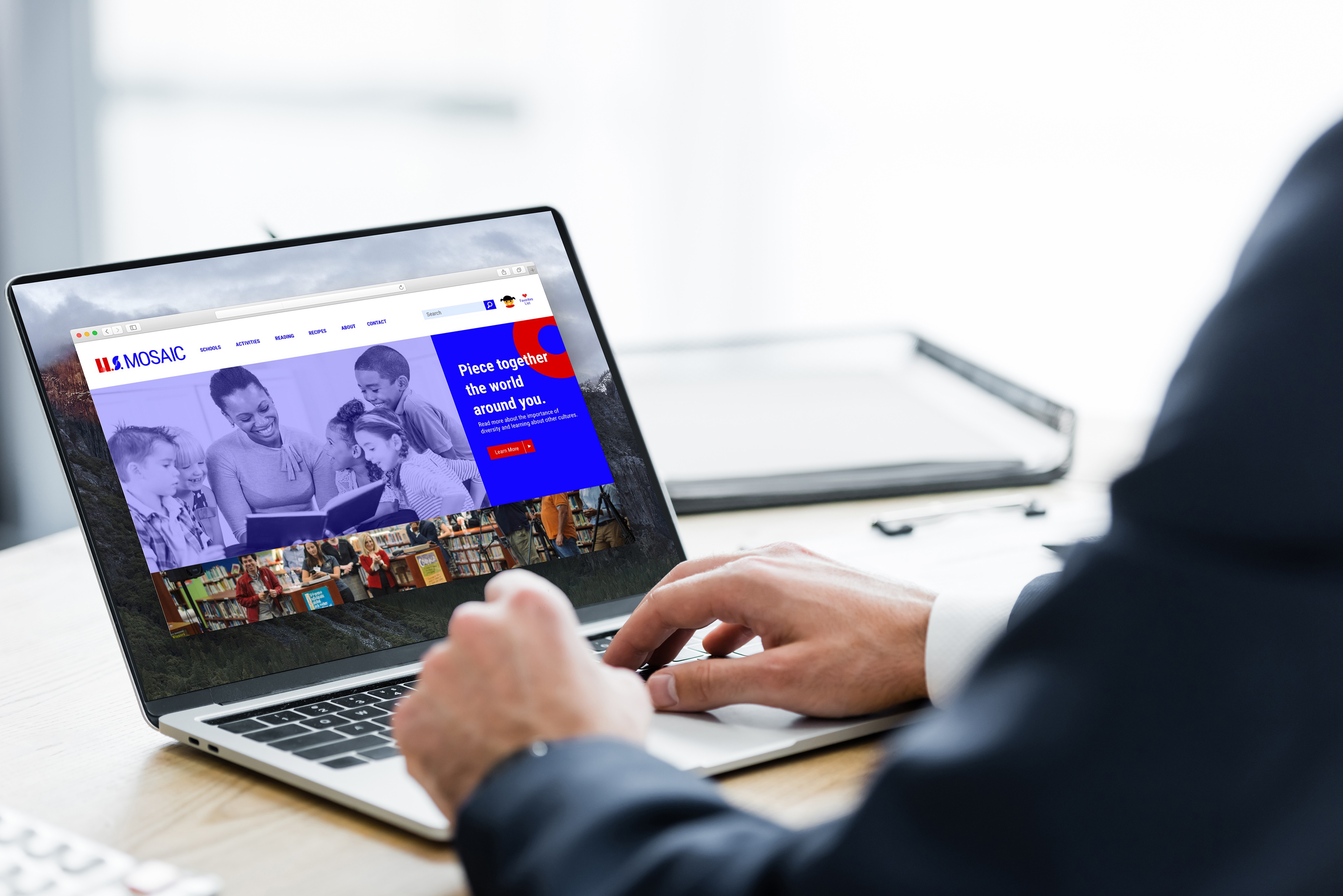
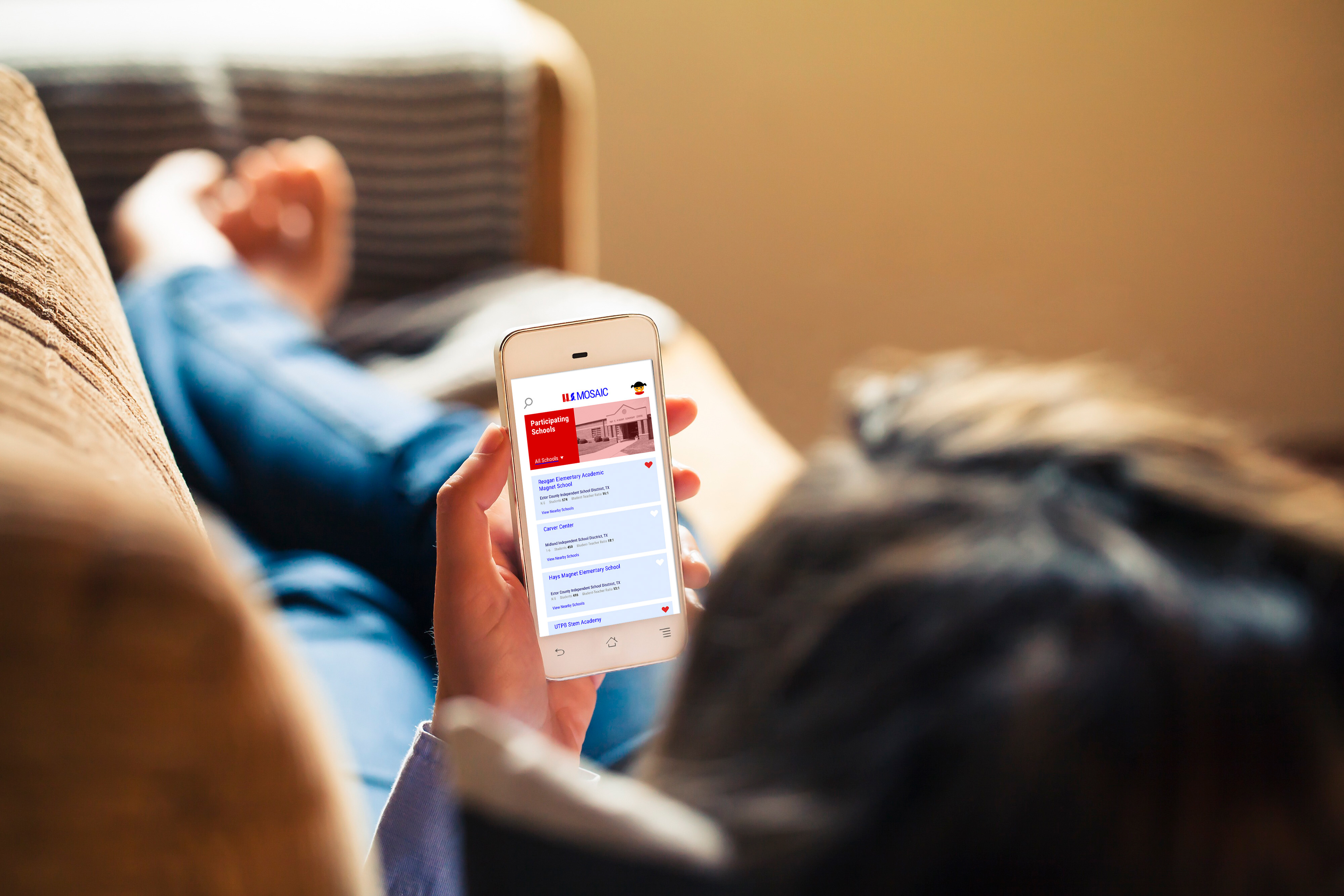
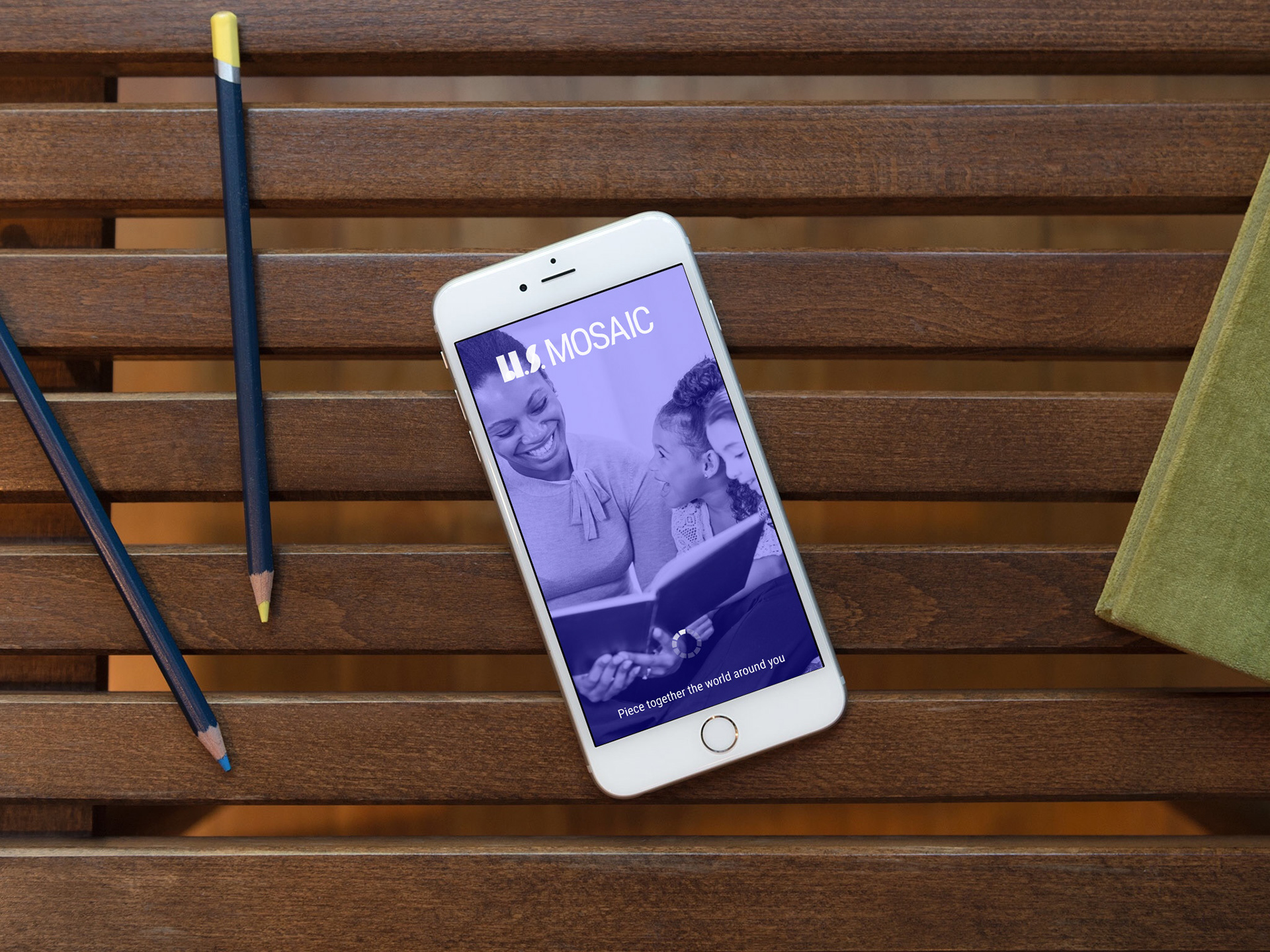
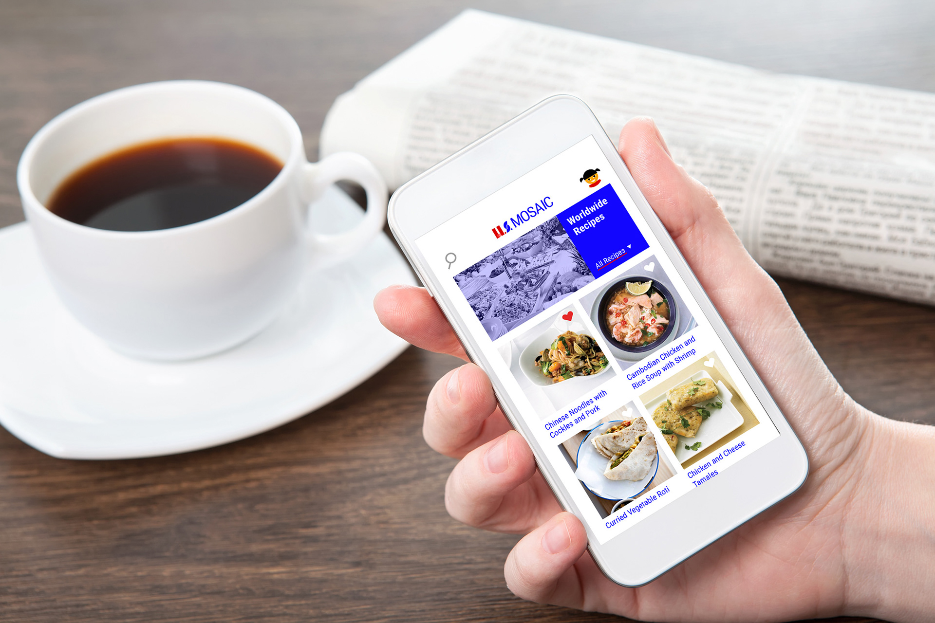
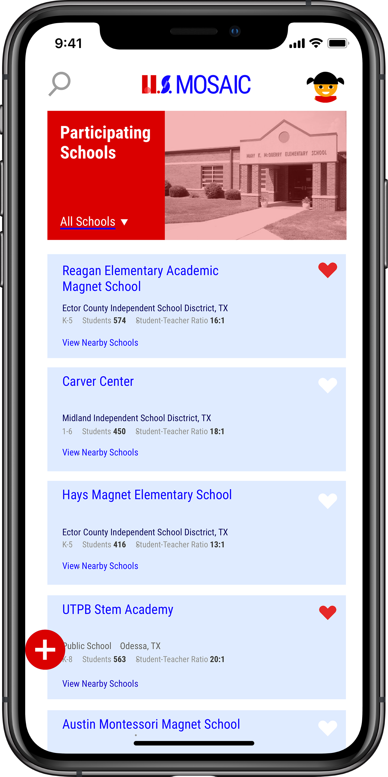
The colors translate very well digitally because they are bold and look well against the white background.
